The composition of MLB players had changed dramatically over MLB's history, with the game opening up to new groups and the rising popularity of the game internationally. For example, the number of foreign-born players has increased over the history of the game, though it dropped back down to its lowest rate since 2006 last year. But I was interested in changes over time in the birthplaces of US-born players. As the population of the United States moved west and south, and MLB opened up to blacks and others I wanted to see how that changed where US-born players came from.
To look at this I color-coded a US map by number of MLB players born in each county during five time periods. I got birthplaces from the Lahman database and then linked those up with the current county that birthplace is in. The maps are color-coded by raw number of players per county rather than the more desirable players per capita. The problem is that some of these counties are new entities, so there is no population data for them going back that to the 1800s or early 1900s.
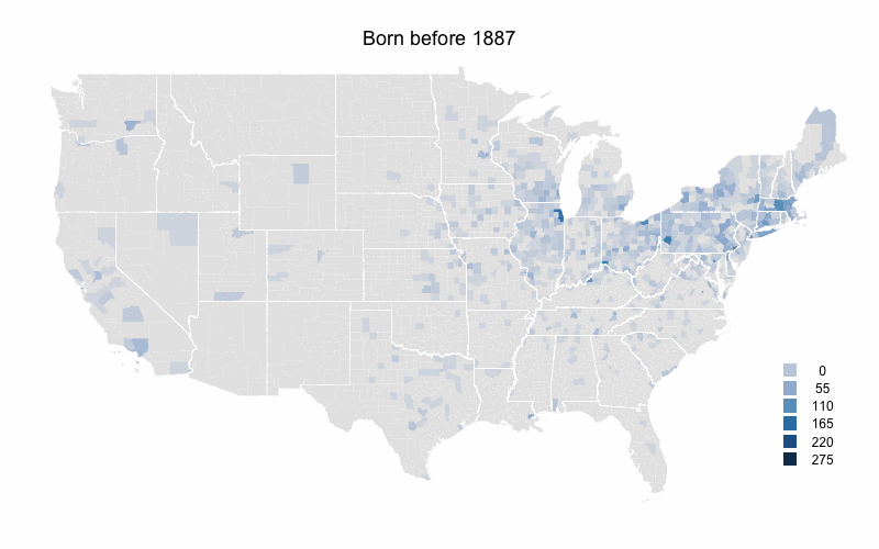
I broke up the time periods so that the number of players born during each is close to equal (about 3000). Here is the first map for players born before 1887.
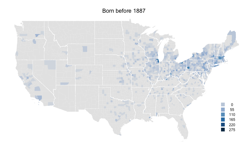
Not surprisingly the northeast has the highest levels. The population of the US was heavily concentrated in the northeast at this time. Cook County (Chicago), Philadelphia County (very small right on the southern border of PA and NJ), and New York County (also hard to see right at the base of Long Island) have the highest. There are very few players from counties south of the Ohio river or west of the Mississippi river.
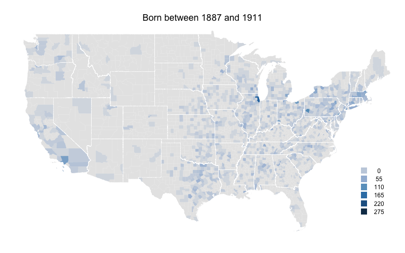
Already there is a shift south and west. The southeastern states, those just west of the Mississippi, Texas and southern California all see increases.
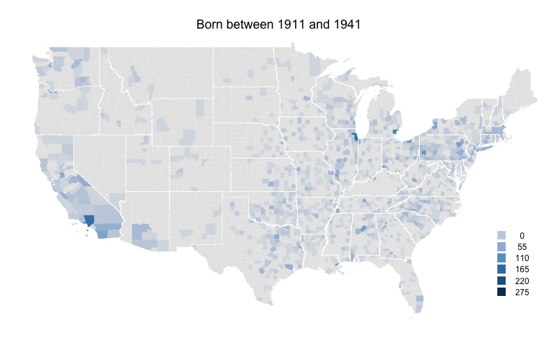
The decline in part of the northeastern US continues. Northern New England and upstate New York are now almost devoid of players. But the Northeast's large cities are still solid, and Wayne County, MI (Detroit) has a big increases. But the main story is southern California where the number of players counties to increase.
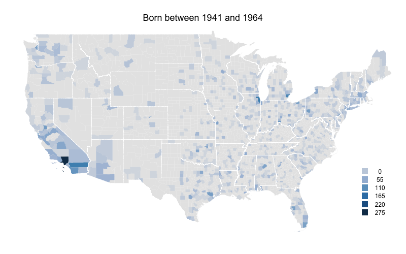
Rural areas in most of the country really start to fall off here. Outside of major metropolitan areas the eastern US has considerably fewer players. The one exception is Florida which has its highest numbers yet. Arizona and Washington also see increases in their numbers. Southern California increases further.
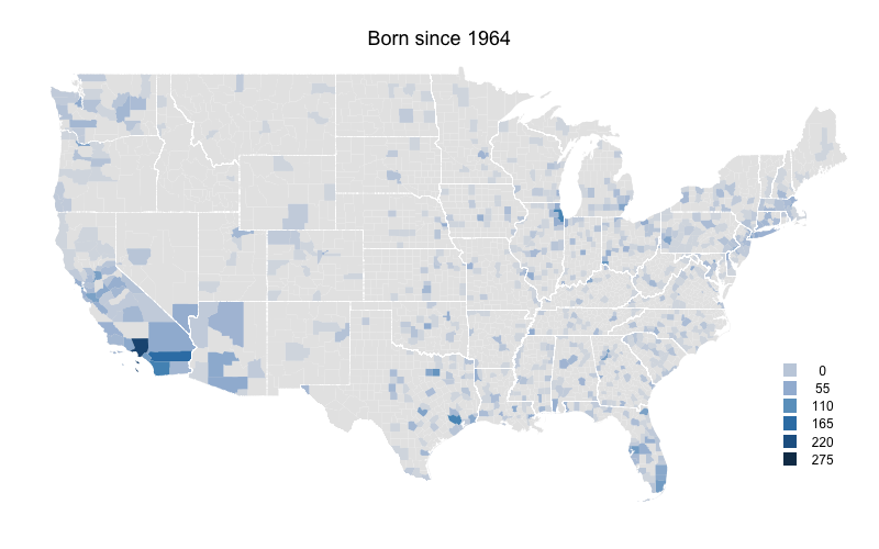
Again rural counties throughout most of the country have very low numbers. On the other hand Florida, Arizona, and to a lesser extent Washington state continue their increases. Clark County, NV (Las Vegas) sees a big increase and southern California still has very high levels.
As a whole these numbers mirror the south and west movement of people in the US, and the movement from more rural counties to more urban/sub-urban counties. At the same time I think that southern California (and the adjacent Clark County, NV and areas of Arizona) are far over represented by baseball players even when accounting for this areas large population.
Though the maps would be better in per capita form, I still think this offers an interesting picture of the history of US-born baseball players. Here they are in animated gif form.
Source: http://baseballanalysts.com/archives/2011/02/usborn_baseball.php
baseball sports news ball glove warehouse baseball simulation games basketball simulation
No comments:
Post a Comment